Roslyn 1823 – Brand Refresh & Packaging
2020 – 7th Annual Diemen Awards – Finalist – Packaging
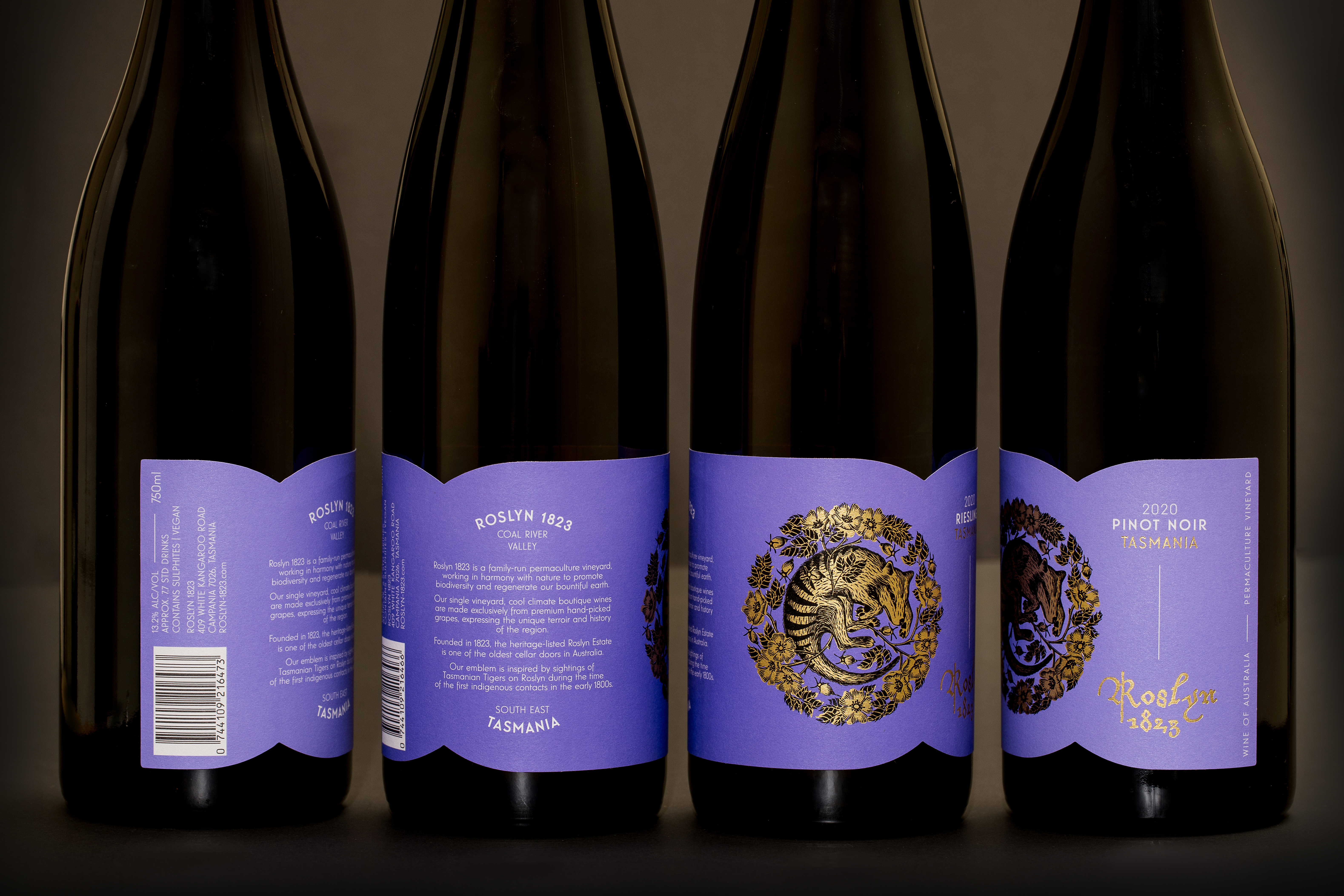
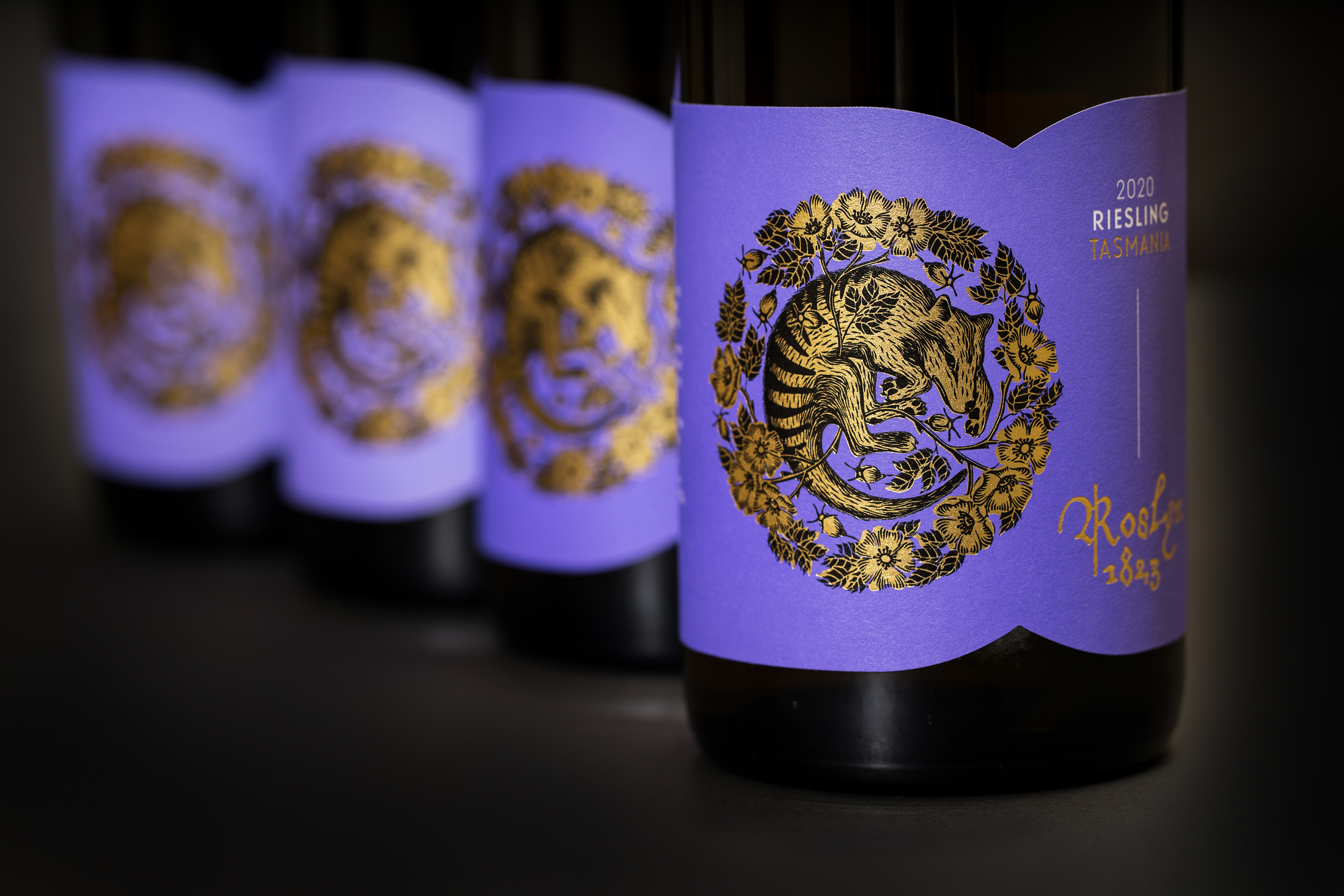
The emblem is inspired by Tasmanian Tiger sightings on Roslyn Estate during the time of the first indigenous contacts in the early 1800s. The tiger, along with the rich purple tones, are elements from the original branding that have been carried across to the refresh.
Historic typography is a nod to the heritage of the estate. The tiger – so beautifully illustrated by Catherine Arsaut – depicted as if been stirred from it’s slumber in a thicket of ‘dog rose roslyn’. These, paired with a bold and contemporary direction for the packaging design complete the refreshed packaging.
2021 – AGDA Awards – Finalist – Packaging / Alcoholic Beverage – Short Run
2020 – 7th Annual Diemen Awards – Finalist – Packaging
The emblem is inspired by Tasmanian Tiger sightings on Roslyn Estate during the time of the first indigenous contacts in the early 1800s. The tiger, along with the rich purple tones, are elements from the original branding that have been carried across to the refresh.
Historic typography is a nod to the heritage of the estate. The tiger – so beautifully illustrated by Catherine Arsaut – depicted as if been stirred from it’s slumber in a thicket of ‘dog rose roslyn’. These, paired with a bold and contemporary direction for the packaging design complete the refreshed packaging.
Role: Creative Direction & Design
Illustration: Catherine Arsaut
Photography: courtesy of MCC
Roslyn 1823. Tasmania.
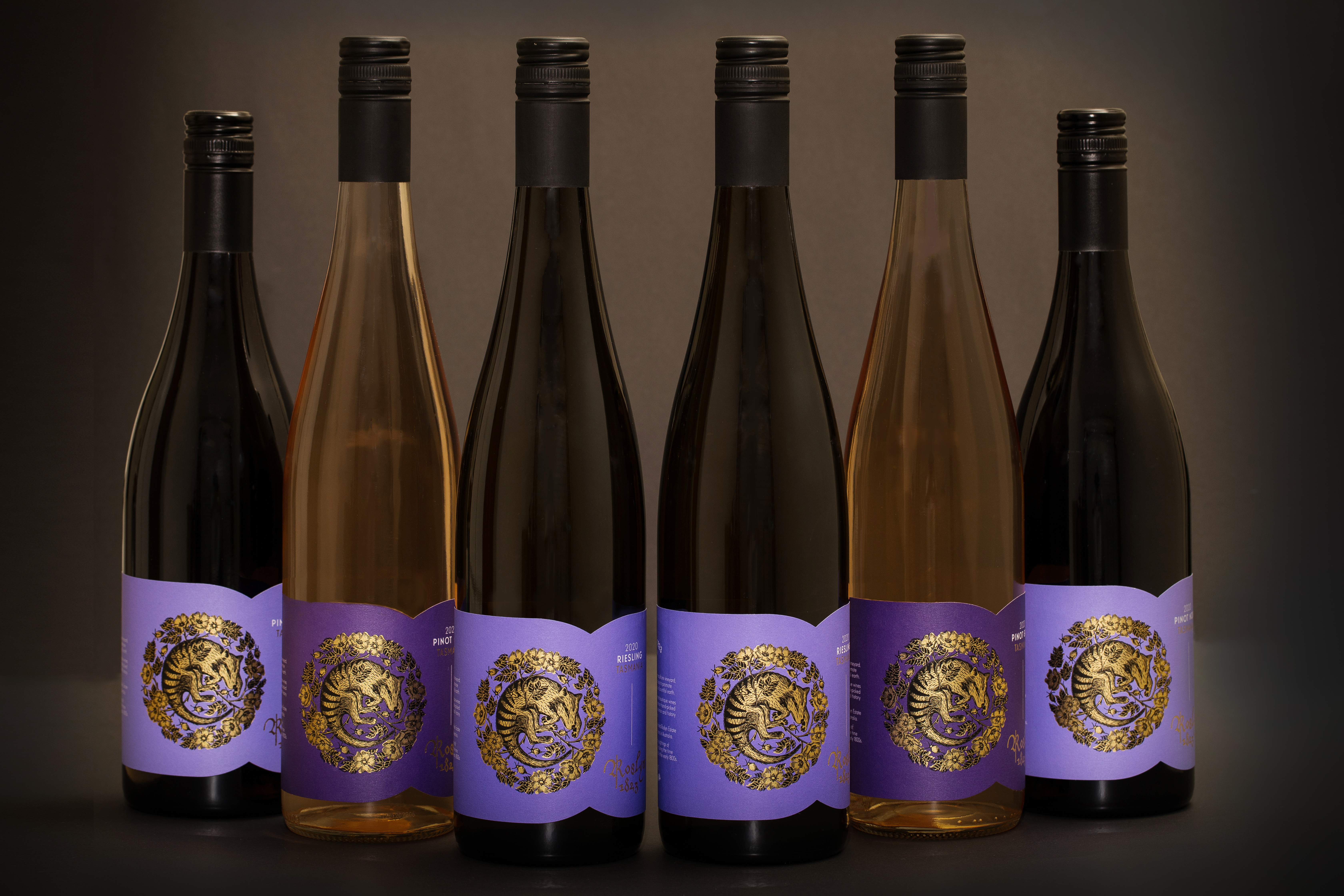
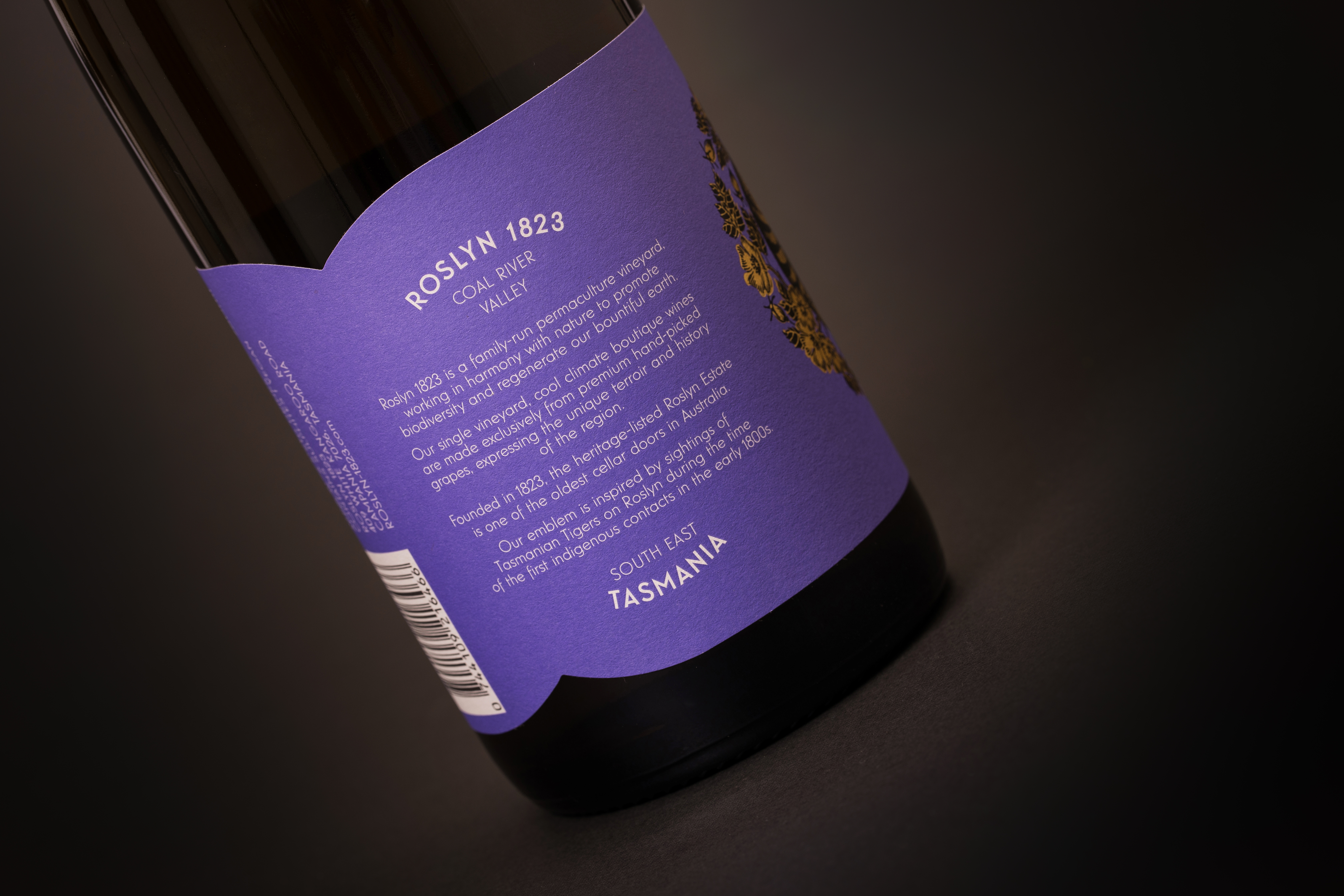
Roslyn 1823 is a family-run permaculture vineyard, situate in the Coal River Valley, in South East Tasmania. Their single vineyard, cool climate boutique wines are made exclusively from premium hand-picked grapes, expressing the unique terroir and history of the region. Founded in 1823, the heritage-listed Roslyn Estate is one of the oldest cellar doors in Australia.
Roslyn 1823 is a family-run permaculture vineyard, situate in the Coal River Valley, in South East Tasmania. Their single vineyard, cool climate boutique wines are made exclusively from premium hand-picked grapes, expressing the unique terroir and history of the region. Founded in 1823, the heritage-listed Roslyn Estate is one of the oldest cellar doors in Australia.